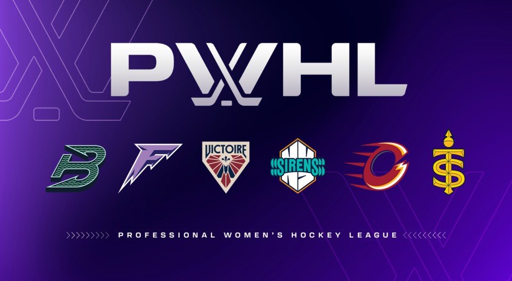
PWHL reveal long-awaited logos and colours for all six franchises
PWHL reveal long-awaited logos and colours for all six franchises
September 9, 2024
By Dallas Knowles
TORONTO, ON — It has been almost a year in the making, but the PWHL has finally unveiled the names, logos, and colour schemes for all six of its franchises.
With the quick start to the inaugural season last year, the League opted to refer to each team using PWHL as a prefix and then the name of the city to give them more time to decide on the team names and logos. Despite the huge success of the PWHL’s first season, fans wanted to have the traditional team nicknames that traditionally go along with professional sports teams.
On September 9th, the PWHL unveiled the new looks for all six teams.
PWHL Vice President of Brand and Marketing Kanan Bhatt-Shah and league executive Amy Scheer were tasked with going through all of the name submissions to come up with the final decisions. The job wasn’t an easy one, as they had to ensure that the League could have the rights to the names in both Canada and the U.S. all while trying to keep with the spirit of each city. The naming committee also wanted to keep the teams’ colour schemes similar to last season so that fans who purchased merchandise last year could continue to wear it to games.
PWHL Montreal will now be Victoire paying tribute to their French-Canadian home. Their logo features a blue "M" for Montreal and a fleur-de-lis, the national symbol of Quebec.
Toronto will be called the Sceptres with blue and gold as their main colours. Sceptres will reflect Toronto’s regal history and the fact that Toronto is Ontario’s capital and sometimes referred to as the “Queen City.”
In Canada’s capital, PWHL Ottawa will now be the Charge sporting red, yellow and white colours. Their logo appears as an unfinished “O” which also resembles a “C” for Charge.
South of the border, PWHL Boston will be called the Fleet, paying homage to Boston’s maritime tradition and will feature a “B” logo in the shape of an anchor.
In New York, the Sirens is an ode to the bright lights and vibrant atmosphere of the Big Apple. The NY in their logo resembles the distinctive skyline of New York City.
PWHL Minnesota is now the Frost reflecting the cold climate and the state’s deep-rooted love for the game. Their purple jerseys will feature an “F” on the front with an icicle design to reflect the Frost nickname.
From a marketing perspective, the new logos will give the PWHL fans a whole new line of merchandise to purchase in support of their favourite team. To be able to see fans sporting the new symbols and colours at the games and out in public will be another step in the right direction for the new league.
Jerseys, home and away, are expected to be released at the end of October or early-November, ahead of the 2024-25 PWHL season, which will get underway shortly after the Rivalry Series.

